Meridian Trust North Star Foundation
Website & App Design
ROLE: Team Lead, Concept, Research, Visuals, Interaction
DURATION: March - May 2021

Project Vision
The Meridian Trust North Star Foundation is a charitable organization founded by Meridian Trust Federal Credit Union, which serves over 32,000 members in Wyoming, Colorado and Nebraska to provide assistance and support to their community members. Formerly all information about the Foundation, including background information, events, sponsorships, grants, scholarship, heating assistance and more was intermingled on the website and difficult to use. In addition, there was no online ability for financial transactions related to the foundation’s work.
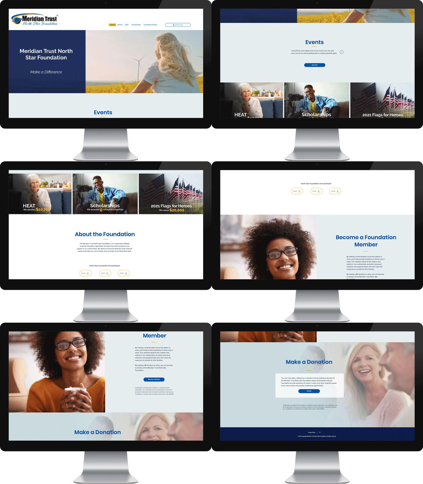
We planned an entirely new website and mobile app to improve access for the members by separating the individual activities of the North Star Foundation. At the URL NorthStarFoundation.com, one can see how we improved the site for both functionality (by clearly separating functions) and for aesthetics with new copy, photos, design, motion, and navigation.
Challenge
1) Rewrite the Copy
2) Investigate the Target Audience
3) Create an Online Donation Payment Process
4) Promote the New Platform


Competitive Analysis
In order to construct a concise and solid foundation for the new site, I compared what our two competitors, Blue Credit Union foundation and WyHy foundation, were already doing and what user goals they were not reaching. I evaluated several features deemed vital from user surveys and identified which ones Meridian foundation could capitalize on to have a leg up over other applications.
I found that both of our competitors don't have simple layouts and aesthetics designs for the homepages, they use too many colors, they crowd spaces, and use hard-to-read fonts that don’t engage members. Also, their presentations were not as engaging and informative as they could be. In addition, Blue Credit Union foundation had duplicate content on their home and landing pages. And WyHy foundation didn’t have a mobile version of their website for members.

Meet the Users

PRIMARY
Name: Lucas
Age: 28
Occupation: Engineer
Lucas is software engineering at warehouse management. He is a public-spirited person try to help the community. He made donations, but as individual donors, he had a hard time to understand the fundraising goal (yearly, monthly) and how these donations will be increased.

SECONDARY
Name: Ruth
Age: 64
Occupation: Retired Teacher
Ruth is a retired art teacher who participate in volunteer work once a week. She often does small donations wherever they are needed, but look forward to get breakdown of how the donations will be used, where does the donation money go, and how does her donating help.
Information Architecture


Wireframes

Wireflow

CHALLENGE 1
Rewrite the Copy
The majority of information on the old website was rewritten within two months.

CHALLENGE 2
Investigate the Target Audience
We identified the preferences of people in and around Wyoming, and created a design that incorporates a fresh, close-to-nature, friendly design style inspired by national parks, windmills and wildlife. With plenty of white space and yellow lines as decoration, the new design has much more appeal to the members and reflects their values.


Create an Online Donation Payment Process
CHALLENGE 3
In order to attract more members and quickly boost online donations ,we developed an online process that included a fast and easy-to-use payment portal with connections to the payment intermediaries DonorBox and Stripe. These changes resulted in an additional 126 new members in the first two months, and raised over $1,200 in new donations.


CHALLENGE 4
Promote the New Platform
We developed marketing materials that explained the new website to members along with a time table of its release. The 2021 College Scholarships program was launched on the site to help promote it. The site also encouraged users to download the app. We tracked web activity throughout this project. On May 18 and July 23, 2021, the site had more visitors and website activity that it had ever had during our tracking period. On those two dates the website had 267 and 278 visits.

Style Guide
Blue and yellow are the two main colors for Meridian's branding. Blue as a sign of peaceful, secure, stability and reliability. The yellow helps evoke a happy feeling out of users. Blue paired with the yellow creates a nice balance between calm and energetic. All the colors of the words have enough color contrast with the color of the background that can grab people's attention. The main typeface of choice for the app is Poppins. This typeface is a best fit for the app because it is extremely versatile through uppercase and lowercase styling and it has dark and light text fills.

